Admit it or not, people do judge by the face. For a modern business, its website is the face. No one wants to leave a bad first impression because of that. If a company’ s web design is considered outdated, disorganized, cluttered, it will lose customers. No doubt.
From confusing user navigation to not-mobile-friendly, a poorly-designed company website can end up driving customers to its competitors. Though a perfect website requires tons of work, the following five basics are already enough for a company to get ahead of others.
Basic #1: Keep your web design clean.
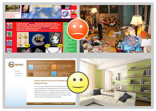
A common but big misconception of communication is, you need to highlight all the important information at the beginning. When it comes to web design, many companies tend to stuff everything on the homepage: brand message, product description, contact means, to name a few.
These are all important information, they would argue. True. But people’s attention span is limited. Either you impress your customers with strong message one at a time, or you lose their attention by offering too much stuff all at once.
So, avoid lengthy, unorganized content, opt-in pop-ups, and affiliate ads. They not only make your site look cheap, but also slow the loading time. Remember, customers’ patience is as short as their attention. They just don’t wait. If too many of them are leaving your site without browsing any further, the high bounce rate will drag your ranking on search engines. You don’t want that.
Basic #2: Shout out CTA, but gently.

The most successful websites are not online catalogues. They provide an experience, guiding customers to conversions. CTA (Call To Action) is vital.
That said, either too strong of a CTA or too weak is a problem. People need to be guided what to do, but not pushed. An unclear CTA will lose their attention. Whereas a compelling one will annoy them.
It is definitely a delicate balance. Have your CTA visible in multiple places on-page. This could be a simple “Learn More” or “Ask Now” near your product description.
Basic #3: Use the right image.
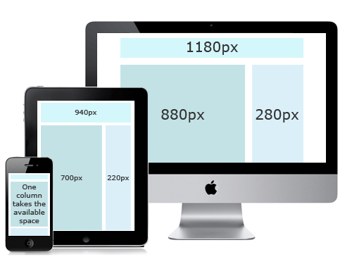
Image is absolutely critical. Not just for e-commerce site that needs high-resolution images for product display. Even images for simple mood-building cannot be of low quality. A blurry photo only coneys one message: you are not taking your business seriously.
Meanwhile, that doesn’t mean you need 4k image for all your pages. Since the digital world is leaning towards mobile nowadays, too big of an image will only end up taking too much loading time. Therefore, having responsive image solution can optimize your site on all screens.
Basic #4: Make sure your site is mobile-friendly.
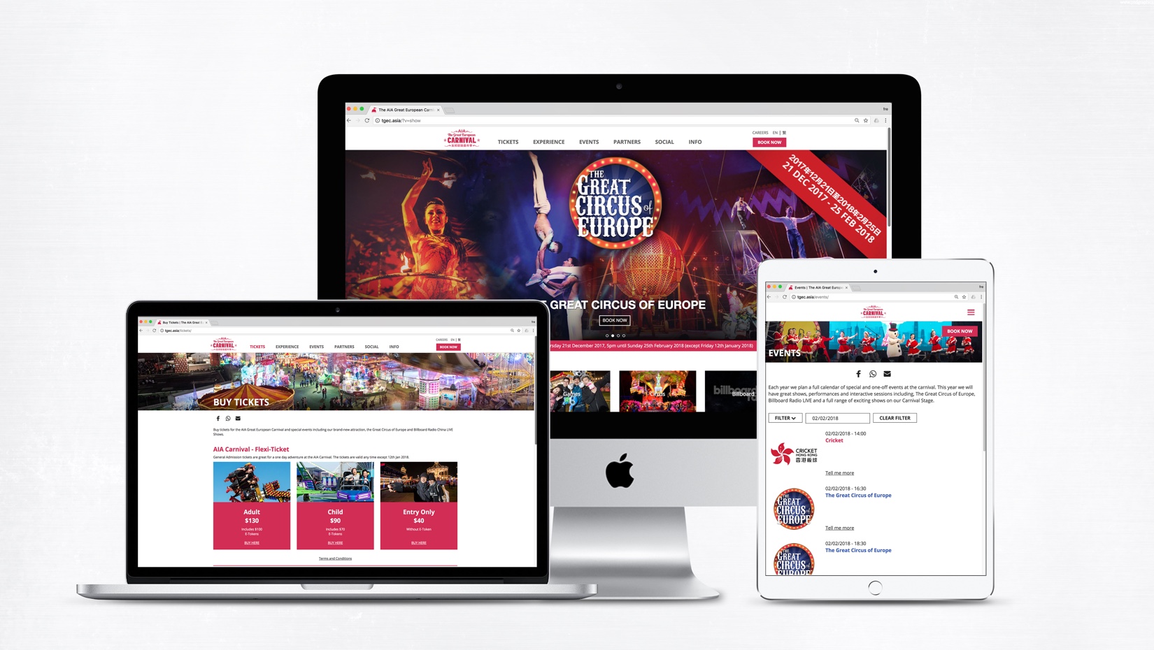
2016 saw, for the first time, the number of mobile users exceeded the number of desktop users. Accordingly, Google is prioritizing mobile-friendly website. And responsive web design has become the norm.
Is your website mobile-friendly? You can use Google’s Mobile-Friendly tool for an analysis. If your result is not good, you should spend a bit more time on fixing this problem.
Basic #5: Navigate the customer journey.
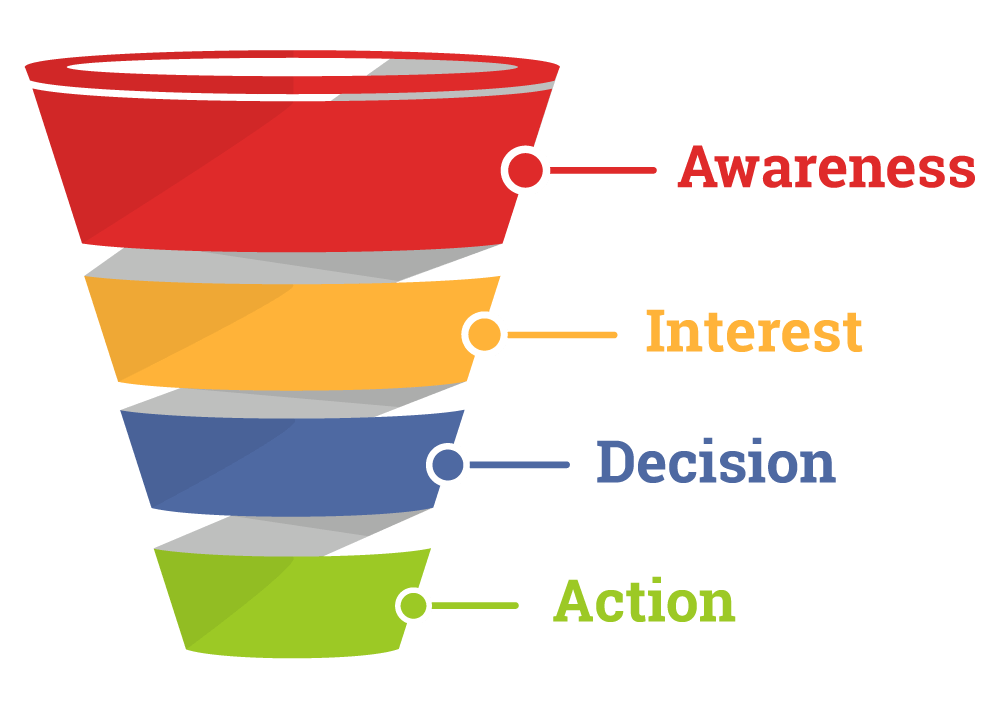
For any website, user navigation is key to drive CTA. Customers are lead to a conversion journey from awareness to action. Believe it or not, not having a clear navigation is one of the most common mistakes in website design.
A powerful customer journey should be simple and fast. From homepage to product page to checkout, customers should be able to navigate easily. Don’t show them around the room. Show them where the door is.
Summary
There are a lot of elements that make a great website. The above five basics seem easy, but not many companies can get it right. Keep in mind that, you are building a website for your customers, not for yourself. In short, only put up useful and well-organized information that can convert your customers.
Find out how DBL has helped the clients in designing successful websites that boosted their business.
Read the full article at: www.influencive.com


